College Search
College Search
Overview
A big part of the RaiseMe experience is helping high school students discover colleges. A dedicated page for college search was designed with this purpose. The existing college search is broken into cards. The card framework is often used to highlight images rather than list items. We wanted to create experiences that not only make colleges recognizable but easy to compare visually, similar to an e-commerce experience.

Parametric Search
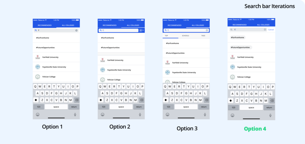
The current college search experience functioned as an exact search. If a keyword is typed exact search only returns discrete items with that keyword. To make our search queries more robust we wanted to move to parametric search. Parametric search includes filters and categories in your search queries. This would mean students could search college names as well as state and cities. We knew this was important to users because students were using these filters the most. Moving to parametric search would mean the search query would be accessing four data points instead of one: college names, location, tags, and suggested keywords, and if not those three search for any colleges that have these characters in the name. With an overload of search results in a small dropdown, this is where I made the decision to remove tags from the experience. It was a newly released feature and future decisions could be made to include if enough students were tagging schools or if the existing filter on the college search page saw some uptick.

On the visual side, I thought we could make the search experience more contextual and robust. Comparison was the major use for college search and we wanted to strengthen that. Core things that aided in comparison: College avatar, college name, and if they offered micro-scholarships. Extra items: follow, unfollow, clear all, tags. The primary information we wanted to showcase was universities and locations since that was the most accessed options from filters

A rule of thumb is to have a 27-characters text input (it would accommodate 90% of queries). We wanted to expand this text input length to draw greater attention to new features to highlight visually a change and the expanded functionality. A new lengthened version was also taken from the current longest college name at 54 characters: Georgia Institute of Technology – College of Design.
Journey-specific experience
One of the tests we wanted to run to improve discoverability by grade level is showing different search experiences based on where a student is in their journey. College Freshman would receive one experience, those in the middle of their college planning experience another and second-semester seniors a paired down experience given their needs. Along with providing contextual search options based on needs, this was an opportunity to add discoverability for our college partners. Partners who may not be seen by students who never use the recommended page would have another opportunity to discover partners right from the search bar.


The Search page

The page itself didn’t need as much as a massive redesign. The filter component functioned well as well as the pills. For the new layout rows seemed easier to scan than cards and allowed for more data points to be visualized. The layout itself also provided some visual differentiation between the search page and the recommendation page. Previously the pages were tabs on our colleges’ page and both used cards and the only distinction between the two was the filters. We made a decision to move away from having a dedicated search page and decided to go the more traditional route of having the page appear only when something is searched.
iOS Search

Continuity between them all is key to deliver a seamless experience. I wanted to have iOS functionality mirror that of Desktop as much as possible. You can only see four cards at a time and the follow button is not in context. There’s no information presented on the cards to make adequate decisions on whether to follow a college or not. With search, we wanted to show more information in context. {insert data point on ios follow button in search} With this I decided to remove the follow button from the search page. Students could still click on the college profile to access the follow button.

More context within search meant surfacing other colleges that might be found desirable. I wanted to provide adjacent information search options, not only the result of the searches but recent searches based on what was previously looked for and similar colleges based on what students have searched and other schools they would be interested in. These suggestions are a mix of colleges with similar data points to colleges searched and data points composed from the student profile.
Adding tags was a way to show students their customization in practice. Students have the ability to tag colleges as it relates to them.
Reflection
Search is a core component of the RaiseMe experience. Showing students If we can more accurately help students find colleges they’re interested in we can start the college planning process sooner leading to more scholarships.

